" height="26.80529977783203px" id="tymKb8bqC" width="128.00300311279295px"/><path d="M 0 2.417 L 0 0 L 12.909 0 L 12.909 2.417 Z" fill="rgb(126, 78, 253)" height="2.417099999999998px" id="aYr4em6zK" transform="translate(128.341 22.325)" width="12.908999999999992px"/></svg>)
"/><stop offset="1" stop-color="rgb(118, 37, 250)"/></linearGradient></defs><g d="M 19.242 21.22 L 19.362 6.204 L 19.272 6.204 L 13.757 21.22 L 10.161 21.22 L 4.796 6.204 L 4.706 6.204 L 4.825 21.22 L 0 21.22 L 0 0 L 7.283 0 L 12.109 13.607 L 12.229 13.607 L 16.844 0 L 24.247 0 L 24.247 21.22 Z M 26.421 26.113 L 26.421 23.445 L 41.407 23.445 L 41.407 26.113 Z" fill="transparent" height="26.112508199679183px" id="DvfaAIHYn" width="41.40731898311435px"><path d="M 19.242 21.22 L 19.362 6.204 L 19.272 6.204 L 13.757 21.22 L 10.161 21.22 L 4.796 6.204 L 4.706 6.204 L 4.825 21.22 L 0 21.22 L 0 0 L 7.283 0 L 12.109 13.607 L 12.229 13.607 L 16.844 0 L 24.247 0 L 24.247 21.22 Z" fill="rgb(46, 46, 46)" height="21.220180016149442px" id="pLsxRCobd" width="24.247352589074694px"/><path d="M 0 2.668 L 0 0 L 14.986 0 L 14.986 2.668 Z" fill="url(%23yD9d4I5GR-3279285344-linear-gradient)" height="2.6675085048549647px" id="yD9d4I5GR" transform="translate(26.421 23.445)" width="14.986002836263765px"/></g></svg>)
Podstawy LinkedIn

Saad Mouaouine
Most LinkedIn posts are invisible. They sit in a feed that moves fast, competing against dozens of other updates from people your audience also follows. The posts that stop the scroll almost always have one thing in common: a visual.
LinkedIn infographics are one of the highest-performing content formats on the platform and one of the most misunderstood.
This guide breaks down what LinkedIn infographics actually are, why they outperform text posts, which formats work best, and how to use them to boost your engagement.
What Is a LinkedIn Infographic?
A LinkedIn infographic is any single static image that communicates information visually. The defining characteristic is that the visual carries the information rather than just decorates it.
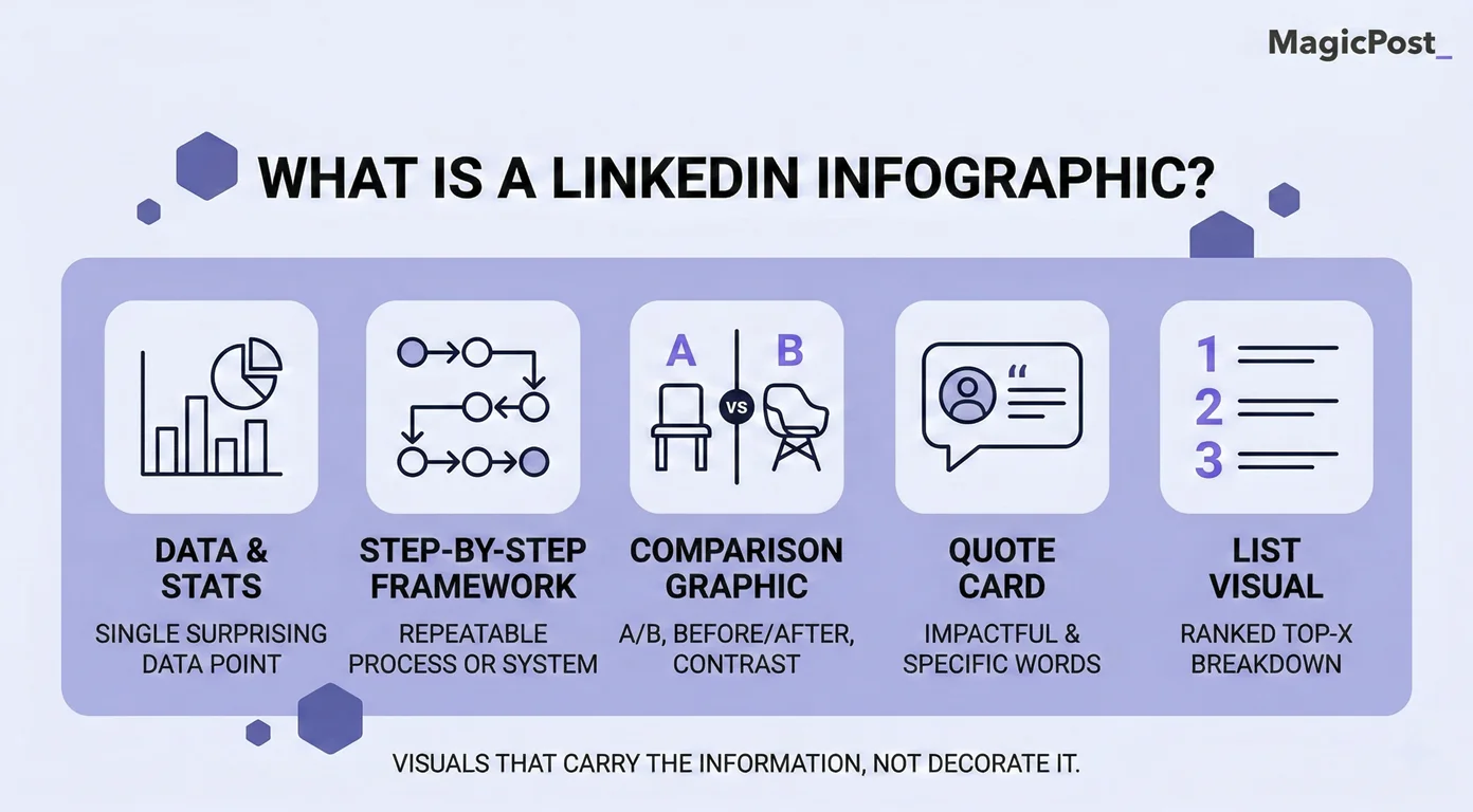
Common types of LinkedIn infographics include:
Data visualizations and stat callouts
Step-by-step frameworks and process diagrams
Comparison and before/after graphics
Quote cards
List visuals and ranked breakdowns
It’s worth clarifying what a LinkedIn infographic is not. A carousel (also called a document post or PDF upload) is a multi-slide format that readers swipe through. They’re a separate format with their own design rules, dimensions, and algorithmic behavior.
This distinction matters because the two formats serve different purposes. An infographic delivers one idea at a glance. A carousel builds an argument across multiple slides. Both work, but they’re not interchangeable.
Why Do Infographics Get More Engagement on LinkedIn?
The performance case for visual content on LinkedIn isn’t a matter of opinion. Here’s what the data actually shows:
LinkedIn posts with images receive 2x more comments than text-only posts. Comments carry the most algorithmic weight on LinkedIn, meaning more comments lead directly to wider distribution.
Human brains process visual information roughly 60,000 times faster than text. In a scroll environment where a post has approximately 1.5 seconds to earn attention, that speed is the difference between being seen and being skipped.
People retain around 65% of information when it’s paired with a relevant visual, compared to roughly 10% when delivered through text alone. For thought leaders trying to build authority over time, that gap has real consequences.
Infographics earn saves. A well-designed visual that communicates something genuinely useful gives people a reason to bookmark the post and return to it. Saves are one of the strongest signals LinkedIn’s algorithm uses to measure content quality.
What Types of LinkedIn Infographics Work Best?
Not all infographic formats serve the same purpose. Here are the five types that consistently perform on LinkedIn and when to reach for each one.
1. Data and Stat Graphics
A single surprising or counterintuitive statistic, visualized cleanly, stops the scroll faster than almost any other format. These work best when the number itself is the insight: something your audience genuinely didn’t know or a figure that challenges a common assumption.
→ Keep these simple. One number, one visual treatment, and a short line of context. The temptation to pack in five statistics at once almost always produces a graphic that’s harder to read and easier to ignore.
2. Process and How-To Visuals
Step-by-step frameworks translated into visuals are among the most saved content on LinkedIn. Professionals are constantly looking for repeatable systems they can apply to their own work. If you have a process that works, a clean visual earns more engagement than a text post describing the same thing.
→ These perform especially well for consultants, coaches, and subject matter experts whose authority comes from methodology. A well-designed process graphic signals structured thinking before anyone reads a single word.
3. Comparison Graphics
Before and after, option A versus option B, the old way versus the new way. Comparison formats create immediate cognitive engagement because they present a contrast the audience wants to resolve.
→ They also tend to spark comments, because people have opinions about which side they prefer.
4. Quote Cards
A well-chosen quote, from a recognized voice or from your own original thinking, displayed cleanly with your branding, is one of the easiest infographic formats to produce and one of the most consistently reshared.
→ The trap is choosing a quote that sounds profound but says nothing specific. “Success is a mindset” is not a quote card. “The best marketing feels like a service” is.
5. List Visuals
Ranked lists, top fives, and curated breakdowns translated into a visual give readers a clear structure to follow and a reason to save it.
→ These perform best when the list reflects a real point of view, not just a generic compilation anyone could have assembled.
What Makes a LinkedIn Infographic Actually Work?
Design quality matters, but the principles that separate high-performing infographics from forgettable ones are simpler than most creators think.
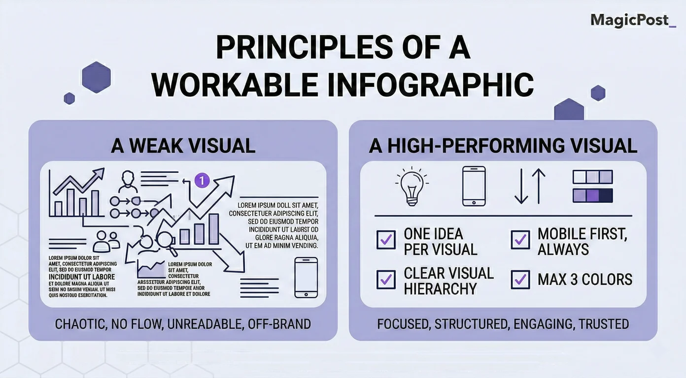
Here’s what you need to keep in mind:
One idea per visual. Every element you add competes for attention with every other element. A focused infographic that communicates one thing clearly will always outperform a dense one that tries to say five.
Mobile first, always. Roughly 65% of LinkedIn traffic comes from mobile devices. If your infographic requires zooming in to read, it’s not working. Design at a scale where the key information is legible on a 5-inch screen without any additional interaction.
Clear visual hierarchy. ****The eyes need to know where to go first. Use size, contrast, and whitespace to create a reading path: the headline or key stat at the top, supporting information in the middle, and context at the bottom.
Three colors maximum. More than three colors in a single graphic creates visual noise. A primary color for key elements, a secondary for supporting information, and a neutral for backgrounds is a palette that works consistently.
For exact dimensions, the standard for a LinkedIn post image is 1200 x 627 px for landscape or 1080 x 1350 px for portrait, with portrait performing better on mobile. For a full breakdown across all formats, see our LinkedIn post size guide.
Should You Use AI to Create LinkedIn Infographics?
AI image generation tools have made it possible to produce visuals in seconds, but should you use them? The answer depends on who’s posting and what the content is trying to accomplish.
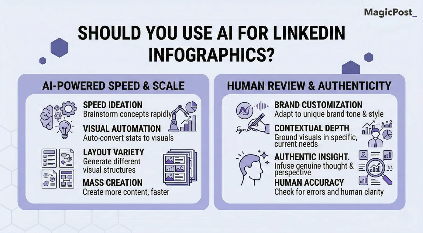
Here’s when you should use AI for LinkedIn infographics:
For Personal Profiles
Audiences on LinkedIn are generally forgiving of production quality when the content comes from an individual. What people are evaluating is the idea and the perspective, not whether a human designer spent three hours on the layout.
→ A clean, AI-assisted infographic that communicates something genuinely useful will perform well on a personal profile.
The caveat is authenticity of content, not quality of design. AI-generated imagery that looks generic will still underperform, not because it was made by AI, but because it communicates nothing distinctive.
For Company Pages and B2B Brands
The calculus changes for brand accounts. Research shows AI-generated imagery erodes trust faster at the institutional level because it signals that no human thought carefully about the visual communication. Audiences expect brands to invest in their presentation.
→ For company accounts, original photography, real data visualizations, and properly designed graphics consistently outperform AI-generated images.
The trust cost of cutting corners is higher when the audience is evaluating a company rather than a person.
In short: AI is great for generating a structural starting point. Using it to produce a rough layout and then refining the design, replacing generic imagery, and ensuring content reflects a genuine point of view is a sensible workflow. The problem is generating and posting without any human review, which produces the kind of content audiences have learned to scroll past.
What Are the Most Common LinkedIn Infographic Mistakes?
Here are the most common LinkedIn infographic mistakes and why they hurt your engagement.
Mistake | Why It Hurts | How to Fix It |
|---|---|---|
Too much text in the visual | Defeats the purpose of a visual; unreadable on mobile | One idea, one graphic. Move details to the caption |
No clear visual hierarchy | The eye doesn’t know where to start | Use size and contrast to create a reading path top to bottom |
Designed for desktop | 65% of LinkedIn is mobile; dense designs lose readers instantly | Test every graphic at phone screen size before posting |
Visual repeats the caption word for word | Adds no value; readers feel their time was wasted | The graphic and caption should complement each other, not duplicate |
AI imagery on brand accounts | Signals low investment; erodes institutional trust | Use real photography or properly designed graphics for company content |
No branding | High-performing infographics get reshared; without your name on it, you lose credit | Add your name, logo, or handle to every visual you create |
How Do You Write a LinkedIn Post to Go With Your Infographic?
This is where most creators leave performance on the table. They spend the majority of their time building the visual and then write the caption in two minutes as an afterthought. That is backwards.
The infographic stops the scroll. The caption earns the engagement. Here’s how the two layers should work together:
Hook first. LinkedIn truncates posts after roughly 140 characters in the feed. Your first line needs to earn the “See more” click before anything else matters.
Add what the visual cannot. The caption should bring perspective, context, or opinion that the infographic can’t carry on its own, not a description of what the image already shows.
Close with a genuine question or call to action. Comments drive distribution. A specific, easy-to-answer question at the end of your caption is the simplest way to generate them.
MagicPost’s Hook Generator and AI Post Writer are built for exactly this layer. You handle the visual while MagicPost handles the post copy that makes people stop, read, and respond. When both are strong, the infographic does what it’s actually designed to do.
Try MagicPost for free; no credit card is required. Start your free trial and write better captions for every visual you post.
FAQ
What is the best size for a LinkedIn infographic?
For a single-image infographic, 1080 x 1350 px (portrait, 4:5 ratio) performs best on mobile and fills more of the feed on desktop. Landscape at 1200 x 627 px is also supported. For a full breakdown, see our LinkedIn post size guide.
How do I make an infographic for LinkedIn?
Canva, Adobe Express, and Visme are the most commonly used tools. Start with a clear single idea, choose a template that matches the format, apply your brand colors, and test it at mobile scale before posting. Pair the finished visual with strong post copy to maximize engagement.
Do infographics perform better than text posts on LinkedIn?
On the metric that matters most algorithmically, yes. LinkedIn posts with images receive 2x more comments than text-only posts, and comments are what LinkedIn’s algorithm weights most heavily in distribution decisions.
That said, a weak visual with a weak caption will still underperform a strong text post. Format is an amplifier, not a substitute for substance.
Can I use AI to make LinkedIn infographics?
Yes, with some important distinctions. For personal profiles, AI-assisted infographics perform well when the content itself is genuine and specific. For company pages, AI-generated imagery tends to erode trust and underperform compared to properly designed visuals.
The quality of the idea matters more than the production method, but brand accounts face a higher credibility bar.
How long should the caption be for a LinkedIn infographic post?
There’s no single correct length, but the first line is the most important element regardless. LinkedIn truncates posts after roughly 140 characters in the feed, so your hook needs to earn the “See more” click before anything else matters.
From there, 150 to 300 words gives you enough space to add context and a call to action without losing readers. The caption should add perspective the visual cannot carry on its own, not repeat what the image already shows.

Jak dodać załączniki w poście na LinkedIn? (2026)
Dowiedz się krok po kroku, jak przekształcić swoje posty na LinkedIn z załączeniami i odkryj, jaki wpływ mogą mieć na widoczność i zaangażowanie twojej treści.

Jak zwiększyć wyświetlenia na LinkedIn: kompleksowy przewodnik
Zwiększ swoje wrażenia na LinkedIn dzięki wskazówkom na temat tworzenia treści, zaangażowania wizualnego i nie tylko. Skup się na wartości i obserwuj, jak rośnie twoja obecność na LinkedIn!

Jak anulować LinkedIn Premium
Dowiedz się, jak łatwo anulować swoje konto LinkedIn Premium zarówno na komputerze, jak i na urządzeniach mobilnych, korzystając z instrukcji krok po kroku oraz odkryj inne alternatywy.
Jak podglądać swój post na LinkedIn przed opublikowaniem go
Dowiedz się, jak podglądać post na LinkedIn przed jego opublikowaniem, aby uniknąć błędów ortograficznych lub formatowania oraz sprawdź generator podglądu postów MagicPost na LinkedIn.
Jak formatować posty na LinkedIn za pomocą formatera tekstu
Dowiedz się, jak sformatować swoje posty na LinkedIn, aby zwiększyć ich widoczność, stosując techniki takie jak używanie przerw w liniach i narzędzi do formatowania tekstu w celu strukturyzowania swoich postów.
What Is LinkedIn Engagement (And How to Master It in 2026)
Struggling with your LinkedIn engagement? Learn how the LinkedIn algorithm measures it, the benchmarks for 2026, and the 4 pillars to boost your interactions.