" height="26.80529977783203px" id="tymKb8bqC" width="128.00300311279295px"/><path d="M 0 2.417 L 0 0 L 12.909 0 L 12.909 2.417 Z" fill="rgb(126, 78, 253)" height="2.417099999999998px" id="aYr4em6zK" transform="translate(128.341 22.325)" width="12.908999999999992px"/></svg>)
"/><stop offset="1" stop-color="rgb(118, 37, 250)"/></linearGradient></defs><g d="M 19.242 21.22 L 19.362 6.204 L 19.272 6.204 L 13.757 21.22 L 10.161 21.22 L 4.796 6.204 L 4.706 6.204 L 4.825 21.22 L 0 21.22 L 0 0 L 7.283 0 L 12.109 13.607 L 12.229 13.607 L 16.844 0 L 24.247 0 L 24.247 21.22 Z M 26.421 26.113 L 26.421 23.445 L 41.407 23.445 L 41.407 26.113 Z" fill="transparent" height="26.112508199679183px" id="DvfaAIHYn" width="41.40731898311435px"><path d="M 19.242 21.22 L 19.362 6.204 L 19.272 6.204 L 13.757 21.22 L 10.161 21.22 L 4.796 6.204 L 4.706 6.204 L 4.825 21.22 L 0 21.22 L 0 0 L 7.283 0 L 12.109 13.607 L 12.229 13.607 L 16.844 0 L 24.247 0 L 24.247 21.22 Z" fill="rgb(46, 46, 46)" height="21.220180016149442px" id="pLsxRCobd" width="24.247352589074694px"/><path d="M 0 2.668 L 0 0 L 14.986 0 L 14.986 2.668 Z" fill="url(%23yD9d4I5GR-3279285344-linear-gradient)" height="2.6675085048549647px" id="yD9d4I5GR" transform="translate(26.421 23.445)" width="14.986002836263765px"/></g></svg>)

Naïlé Titah
Most "best LinkedIn format" articles tell you which format collects the most likes. That is a useful question, and we answer it elsewhere. But it quietly rewards formats that big accounts happen to favor, because a like count rises with audience size. This page asks the fairer question: of the people who actually saw a post, what share engaged with it? Measured that way, on 497,946 posts with synced analytics, the order is clear and it is not the order most blogs report.
Image posts convert 3.10% of their viewers into a like or comment. Polls convert 0.62%. That is a five-fold gap between the best format and the worst, and it holds whether you publish to a thousand followers or a hundred thousand, because dividing by impressions removes the size advantage that follower-based numbers smuggle in.
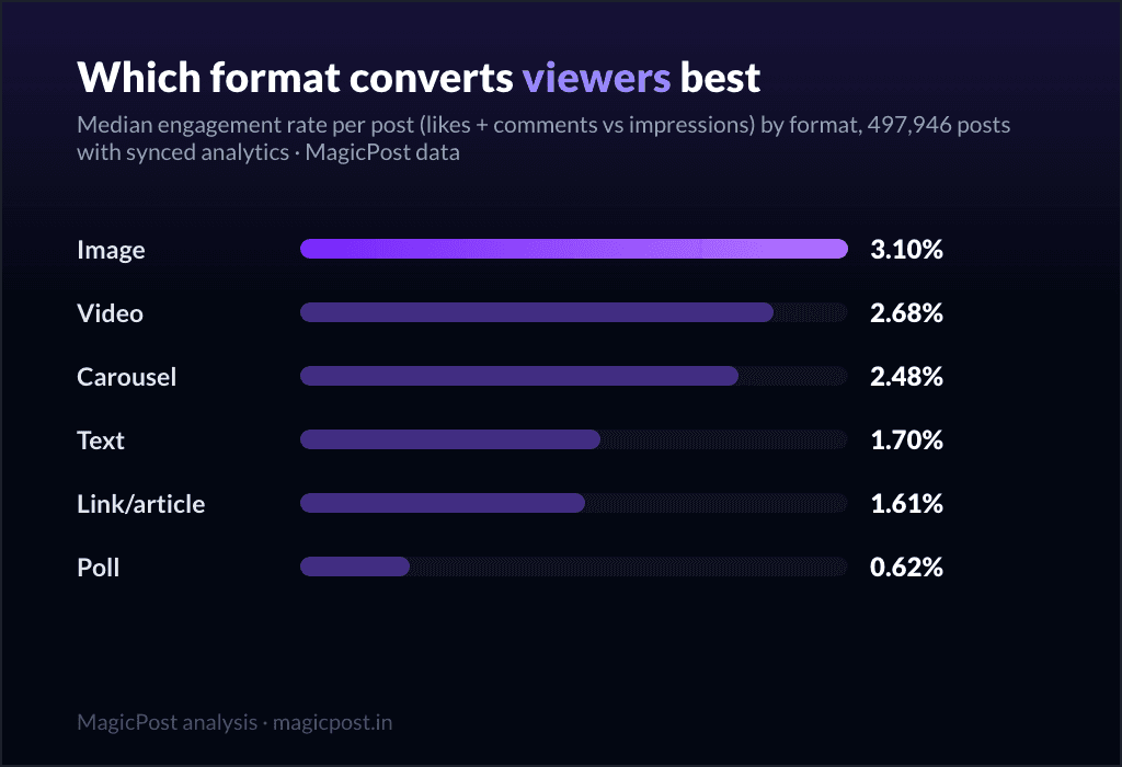
TL;DR: Images convert viewers best on LinkedIn: a 3.10% median engagement rate vs impressions, ahead of video (2.68%) and carousels (2.48%). Text converts 1.70%, link posts 1.61%, and polls trail everything at 0.62%.
Why we measure against impressions, not followers
Engagement rate needs a denominator, and the choice changes the answer (the full two-definition story, with the by-size ladders, lives in the average engagement rate on LinkedIn). Divide engagement by followers and you mostly measure who tends to post each format: video and carousels skew toward larger, more produced accounts, so a follower-based ranking partly reflects audience size rather than the format itself. Divide by impressions and you measure the only thing the format controls, the conversion of a view into an action. That is the honest comparable across formats, so every number below is engagement (likes plus comments) divided by the post's own impressions. (For the full two-definition explanation, see the pillar on the average engagement rate on LinkedIn.)


The ranking: engagement rate vs impressions, by format
Here is the full table. The median column is the typical post; p75 is a good post of that format; p90 is a top one. Median likes and sample size sit alongside each rate so you can see what each format trades.
Format | Weak (p25) | Typical (median) | Good (p75) | Top (p90) | Median likes | Posts measured |
Image | 1.79% | 3.10% | 5.27% | 9.02% | 26 | 311,711 |
Video | 1.60% | 2.68% | 4.33% | 6.89% | 20 | 36,739 |
Carousel | 1.42% | 2.48% | 4.82% | 9.28% | 27 | 31,103 |
Text only | 0.92% | 1.70% | 3.03% | 5.19% | 13 | 86,225 |
Article | 0.89% | 1.61% | 2.58% | 3.90% | 8 | 26,359 |
Poll | 0.27% | 0.62% | 1.30% | 2.46% | 5 | 5,809 |
Read it as three tiers. Visual formats lead: image (3.10%), video (2.68%) and carousel (2.48%) all convert above 2.4% of viewers. Pure-text formats sit in the middle: a plain text post converts 1.70%, an article 1.61%. Polls trail everything at 0.62%, roughly a third of the rate of a text post and a fifth of an image.
One number to take personally: the median image post converts 3.10% of its viewers, but a good one (p75) converts 5.27%, and a top one (p90) converts 9.02%. Those are format-specific targets. If you post images and your conversion sits below 1.79% (the p25), the format is not the problem, the post is.
The poll paradox
Polls are the strange case, and they close the loop on a finding from elsewhere on this blog. Polls are seen more than almost anything: LinkedIn surfaces them widely because a one-tap vote is the cheapest possible interaction, and that reach is exactly why people keep posting them. (We dug into that reach-versus-result trap in do LinkedIn polls actually work.)
But reach is not engagement, and this table is the punchline. Once you divide by the impressions polls so easily collect, they convert the worst of any format, 0.62% of viewers, with a median of just 5 likes. A vote is not a like or a comment, and the very thing that wins polls their reach (the frictionless tap) is the thing that stops viewers from doing anything we count as engagement. Seen the most, engaged with the least. If you run polls, run them for reach and distribution, never as your engagement play.
Where do your formats land? MagicPost's LinkedIn analytics compute the engagement rate of every post you publish, against your own viewers, so you can see which formats convert for your audience rather than the platform median. And if you want these reference numbers refreshed without redoing the math, the MagicPost Benchmark delivers them to your inbox every month, recomputed on fresh data.
Why visual formats convert best (a hypothesis)
The data is firm; the explanation is informed guesswork, so treat it as a hypothesis rather than a law.
The likely mechanism is attention. An image is consumed in full almost instantly, so the decision to react happens inside the same glance that delivered the impression. The viewer sees, reacts, scrolls, and the whole loop closes before attention drifts. A carousel works similarly once someone swipes: it earns the highest top-end of any format (p90 of 9.28%, just above image's 9.02%), and its median likes (27) actually edge image's (26), because a viewer who commits to swiping is already engaged.
Long formats split attention. An article or a long text post asks the viewer to consume and engage as two separate acts: read first, then decide to react, and many viewers leave after reading without ever returning to the like button. That split is the simplest reason articles convert at 1.61% while images convert at 3.10%, despite both being seen by real people. Video sits in the middle: faster than reading, slower than a glance.
None of this means you should only post images. The formats that convert hardest also crowd the feed hardest, and a carousel built with care still earns the highest ceiling of any format here. The point is to know the conversion you are buying with each choice. If you want to test the same idea across formats quickly, MagicPost's AI LinkedIn post generator drafts it in any format so you can compare them on your own audience.
How this differs from the "best format" ranking
This page and our best LinkedIn post format guide measure two different things, and they do not always agree.
That page ranks by median likes, the absolute volume of reactions a format earns. It rewards formats that pull big raw numbers.
This page ranks by what share of viewers engage, conversion, independent of how large the audience is.
The two rankings broadly agree at the bottom (polls lose on both) and broadly agree that visual beats text on both. But they disagree at the very top: judged by median likes in our data, carousels (27) and images (26) sit essentially level, with carousels nudging ahead, whereas judged by viewer conversion, images (3.10%) clearly lead carousels (2.48%). The difference is exactly the metric: carousels collect a hair more raw reactions per post, but images turn a higher share of the people who see them into engagers. Use the likes ranking when you care about total reactions; use this one when you care about how efficiently a format earns them.
What to do with this
Default to images for the highest typical conversion (3.10%), unless you have a reason to do otherwise.
Use carousels for ceiling. Their p90 (9.28%) is the highest of any format, so a strong carousel can out-convert a strong image.
Treat polls as reach, not engagement. They are seen widely and engaged with least (0.62%).
Judge each post against its own format. A 2.5% image is below par; a 2.5% article is excellent. The per-format percentiles above are the targets.
Compute against impressions when you can. It is the only fair way to compare a format you post often against one you rarely post.
Put your whole LinkedIn routine in one place. MagicPost handles the writing, the scheduling and the analytics, so the only thing left to produce is the post worth seeing.
Where this data comes from
Everything on this page is MagicPost's own research. We measured the engagement rate of 497,946 LinkedIn posts with synced analytics (the subset where impressions are known), published over the last 12 months by individual creators with at least 100 followers, reshares and deleted posts filtered out. Engagement rate is computed per post as (likes + comments) divided by that post's impressions, then summarized with medians and percentiles so no viral outlier can bend a row. We report against impressions, not followers, on purpose: a follower-based comparison across formats would partly measure which accounts post which format rather than the format itself. Format counts range from 5,809 polls to 311,711 image posts, and every rate carries its sample size. Figures dated June 2026, refreshed with the data.
SSS
Which LinkedIn format has the best engagement rate?
Image posts. Measured against impressions on 497,946 posts with synced analytics, the median image post converts 3.10% of the people who saw it into a like or comment, ahead of video (2.68%) and carousel (2.48%). Pure-text posts convert 1.70%, articles 1.61%, and polls last at 0.62%. Visual formats lead because an image is consumed in full at a glance, so the decision to engage happens inside the same view.
What is a good engagement rate for a LinkedIn image post?
Aim for the 75th percentile of that format: a good image post converts 5.27% of its viewers, and a top one (90th percentile) reaches 9.02%. The typical image post sits at 3.10%, and anything below 1.79% (the 25th percentile) is a weak post for the format. Each format has its own scale, so always judge an image against images, not against the platform average.
Why do LinkedIn polls have such low engagement rates?
Polls are surfaced widely because a one-tap vote is the cheapest interaction on the platform, so they collect a lot of impressions. But a vote is not a like or a comment, and once you divide engagement by those large impression counts, polls convert just 0.62% of viewers, the worst of any format, with a median of 5 likes. They are a reach tool, not an engagement tool. More on the trade-off in do LinkedIn polls actually work.
Should I judge formats by likes or by engagement rate?
It depends on the goal. Ranked by median likes, carousels (27) and images (26) sit roughly level at the top, so if you want raw reaction volume, see the best LinkedIn post format ranking. Ranked by the share of viewers who engage, images (3.10%) clearly lead carousels (2.48%), which is the fairer comparison when your formats reach audiences of different sizes. Carousels collect a touch more raw reactions; images convert a higher share of viewers.

Which Type of LinkedIn Post Gets the Most Engagement? 22 Types, Ranked (1.1M Posts)
Which LinkedIn post types get the most engagement? Celebrating a win leads at 1.21%; podcast shares and webinar pushes trail at 0.29-0.31%. 22 types ranked.

What Is the Average Engagement Rate on LinkedIn in 2026? (We Measured 1.1M Posts)
What is the average engagement rate on LinkedIn? 0.39% vs followers, 2.63% vs impressions, on 1.1M posts. Full ladders by follower count.

How Many Impressions Does a LinkedIn Post Get? The Median Is 788 (539,310 Posts Measured)
How many impressions does a LinkedIn post get? The median is 788 (539,310 posts measured): p25 307, p75 2,236, p90 6,825. The full spread.

What Is a Good Engagement Rate on LinkedIn? It Depends on Your Size (Here Are the Ladders)
What is a good engagement rate on LinkedIn? Your size band's p75: 3.43% under 1k followers, 0.66% at 10k-50k (vs followers); above 4% of viewers anywhere.

How Many Likes Is Good on LinkedIn? The Median Post Gets 28 (1.1M Posts Measured)
How many likes is good on LinkedIn? The median post gets 28 (1.1M posts measured). Good for your size: 15 under 1k followers, 695 at 100k+.

How Many Comments Is Good on LinkedIn? The Median Post Gets 6 (1.1M Posts Measured)
How many comments is good on LinkedIn? The median post gets 6 (1.1M posts) and a quarter get at most 1. Good for your size: 4 under 1k, 114 at 100k+.

LinkedIn Engagement Rate by Topic: What Subjects Actually Earn (1.1M Posts)
LinkedIn engagement rate by topic, on 1.1M posts: graphic design leads at 1.16%; AI (0.24%) and HR (0.21%) sit at the bottom. 44 topics ranked.

LinkedIn Engagement Rate by Country: Pakistan and Nigeria Lead, the US Trails (21 Countries Measured)
LinkedIn engagement rate by country: Pakistan (1.16%) and Nigeria (1.14%) lead, France 0.49%, the US 0.26%. 21 countries measured on 1.1M posts.

LinkedIn'de Kaç Gösterim İyi Sayılır?
LinkedIn'de kaç görüntüleme iyi? İşte cevabı.

The Best LinkedIn Post Format in 2026 (We Measured 1.2 Million Posts)
The best LinkedIn post format in 2026, measured on 1.2M posts: image and carousel lead at 34 median likes, video is rising, polls are last. Full data.