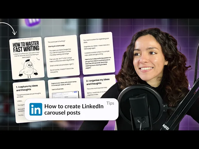

Margot Daugieras
LinkedIn carousels are escalating in popularity, even though the site stopped native carousel publishing. So, what's the secret?
It's all about documents! By using LinkedIn’s document upload feature, you can share captivating slides. With tools like Canva or Figma, you can create eye-catching presentations that keep your audience hooked.
This guide will walk you through everything you need to master LinkedIn carousels. Ready? Set. Go!
TL;DR: The secret to master carousels on LinkedIn lies in using documents to share compelling slides. Here are the main elements : emphasizing repurposing content, creative visuals, and simplicity for maximum engagement.
What’s a LinkedIn carousel post?
A LinkedIn carousel post lets you share multiple images or slides in one go, typically uploaded as documents that viewers can swipe through.
They’re fantastic for showcasing your brand identity with visuals, adding your logo, or telling a compelling story.
Plus, people can view and download your carousels directly on LinkedIn, and the platform's algorithm loves them, making it a great way to boost your LinkedIn post!
Why use LinkedIn carousels?
Now you’re asking yourself: Why create a carousel when you can just share text? Glad you ask!
But here’s the game-changer: LinkedIn carousels get five times more clicks than any other content type. That’s a massive spike in engagement and visibility!
If investing time in creating carousels can significantly boost my engagement and visibility on the platform, then count me in.
People love carousels for good reasons. They’re visually appealing, easy to consume, and engaging. If you're looking to make a real impact and maximize your efforts, carousels are definitely the way to adopt.
The Benefits of using LinkedIn Carousels
To quickly summarize the benefits of using this method, if you're still not convinced (and you will be after reading on below, truste me!), here's a list you may find useful:
They ramp up your interaction rates.
Perfect for narrating a story with multiple images.
Great for funneling visitors to your company or personal profile.
Seamlessly combine charts, images, and text for powerful messaging.
Ideal for highlighting product or service benefits.
Helps establish your brand as a thought leader in your community.
Effective in driving click-through rates to your websites or landing pages.

Now that you’re clued in on the carousel benefits, let’s dive into the specifics!
How to create a LinkedIn carousel?
You do not need to be a graphics designer to create quality carousels. All you need is a tool like Canva or Figma for example. Canva has a rich library of templates, designs, images, and elements to choose from, so creating your carousel is a breeze.
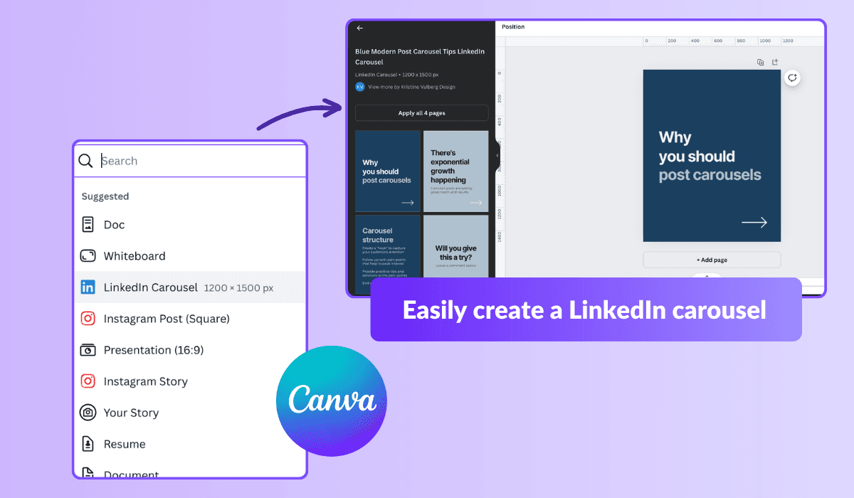
Let’s see how you can create a carousel in minutes using Canva :
Get the application on your desktop or mobile device.
Navigate to the plus sign (+) or use the Create Design tab.
Enter LinkedIn Carousel in the search bar.
Preview the different templates results till you find the one you like.
Customize the templates by adding your preferred image, text, and even your brand logo (if you have one).
If there are not enough pages, you can either duplicate them or add extra blank pages to the design.
Review your carousel for final touches after designing. Check for element harmonization and grammar. Remember, you can’t edit once your post is live.
Click the share button and choose the PDF format for download once you’re done.
You really it was over? For the best results when creating carousels, make sure your images are sized at either 1200 x 1500 pixels to keep them looking sharp and professional.
Keep your titles concise and captivating, sticking to 255 characters or less, and your intro text should be a snappy 150 characters to ensure it catches attention on all devices.
With these tips, your carousel will not only look great but will also engage your audience effectively.
LinkedIn Carousel Ideas to Captivate and Engage
Creating and publishing carousels is just the start. Knowing what content captivates and drives engagement is key. Here are some top ideas to supercharge your LinkedIn presence:
Listicles: Carousels are perfect for listicles, as each slide can introduce a new point or idea, making your list not just readable but interactive and engaging. This format is excellent for sharing quick tips, must-know facts, or steps in a process.
Job Postings: Looking to fill positions? Carousels are ideal for highlighting job openings with detailed slides for each role or summarizing multiple positions in one go. This not only grabs attention but also provides a richer, more engaging way to present career opportunities compared to traditional text posts.
How-To Guides: Combine compelling images and clear text to create engaging step-by-step instructions. Whether it's a tutorial on industry best practices or a guide on using a product, carousels can make complex information easy to digest and follow.
Trends: Use carousels to highlight the latest industry trends. Incorporate charts, graphs, and stats to provide your audience with valuable insights in an easy-to-swipe format. This can position you as a thought leader and keep your network informed about what’s hot in your field. Using trends can really help you become an expert!
Product Showcases: Want to spotlight your products or services? Carousels are fantastic for showcasing key features and benefits with eye-catching visuals and concise descriptions. Each slide can highlight a different aspect, making it a dynamic way to present your offerings.

Client Testimonials: Sharing success stories and client feedback? Use carousels to feature quotes and stories from satisfied customers. This not only builds credibility and trust but also makes your testimonials more engaging and impactful.
FAQs: Have common questions or myths you want to address? Create a carousel to educate and inform your audience. Each slide can tackle a different question, making it an effective way to provide detailed answers and helpful information in a format that’s easy to consume.
By leveraging these ideas, you can create compelling LinkedIn carousels that not only attract attention but also engage and educate your audience. Start experimenting with these formats to see how they can boost your content strategy and enhance your LinkedIn presence!
Top Tips for Engaging LinkedIn Carousels
Looking to craft carousels that captivate and convert? Told you it was great idea to read this article, because here's a little present for you. Some of the best practices to perform well on LinkedIn with carousels :
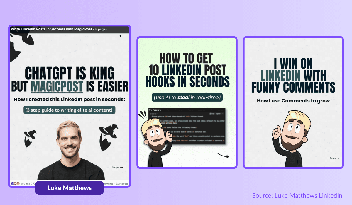
Showcase Stunning Visuals
Use high-quality images that grab attention.
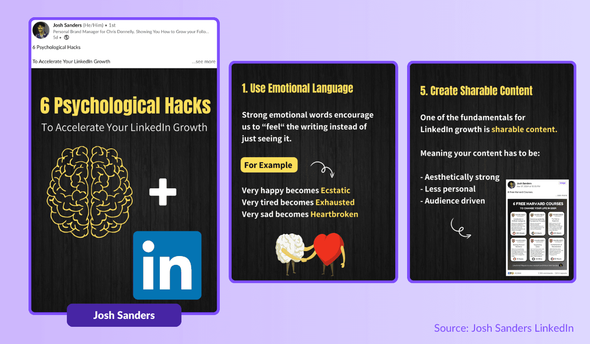
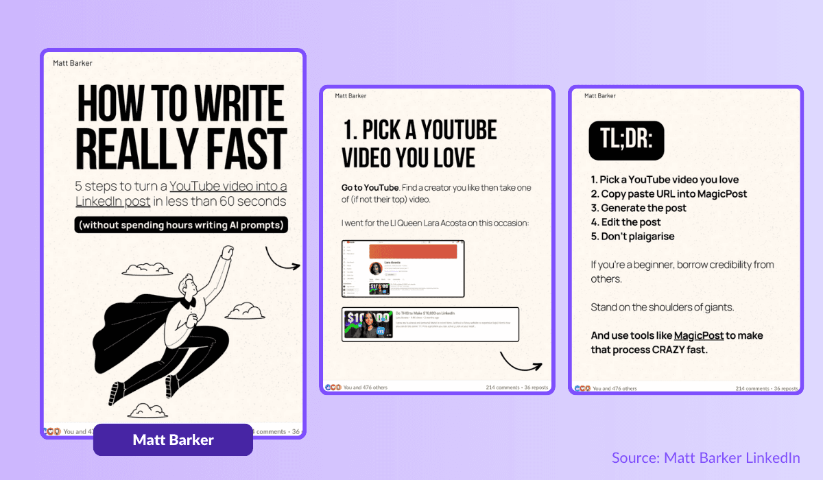
There's nothing like an good example from a professional using carousels (and MagicPost) as real seduction weapons for his audience. See how it is done below ? Clear. Catchy. Simple. You just want to swipe and discover the rest.
Keep It Snappy
Limit the number of slides to keep it concise unless you have more to say.
This is an extremely important concept in your carousels. You don't need to waste your audience's time with useless content. Unless, of course, you're writing a novel with the talent of Stephen King.
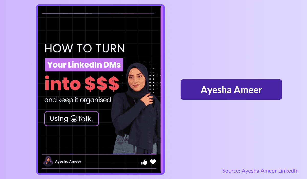
Make a Grand Entrance
Using a captivating first slide in your LinkedIn carousel is like turning on a spotlight in a crowded room—it grabs attention, fuels engagement, and sets your content apart from the rest.
It should be your obsession (Yep, it’s not even a joke!). A great hook is essential, crucial, for standing out, sparking interest, driving action, and making your carousel a must-see sensation on the platform.
Think Mobile First
On which device are you using LinkedIn? That's what I thought! The platform is increasingly used on mobile devices. And rightly so.
Designing your LinkedIn carousel with a mobile-first mindset is essential to captivate the on-the-go audience, ensuring your content is crisp, accessible, and highly engaging on any device.
It not only boosts your reach and engagement but also gives you a competitive edge in a mobile-dominated world!
Less is More
To truly capture and keep your audience’s attention—no easy feat these days—keep sentences short and words simple. Be direct and to the point, and keep text minimal on each slide.
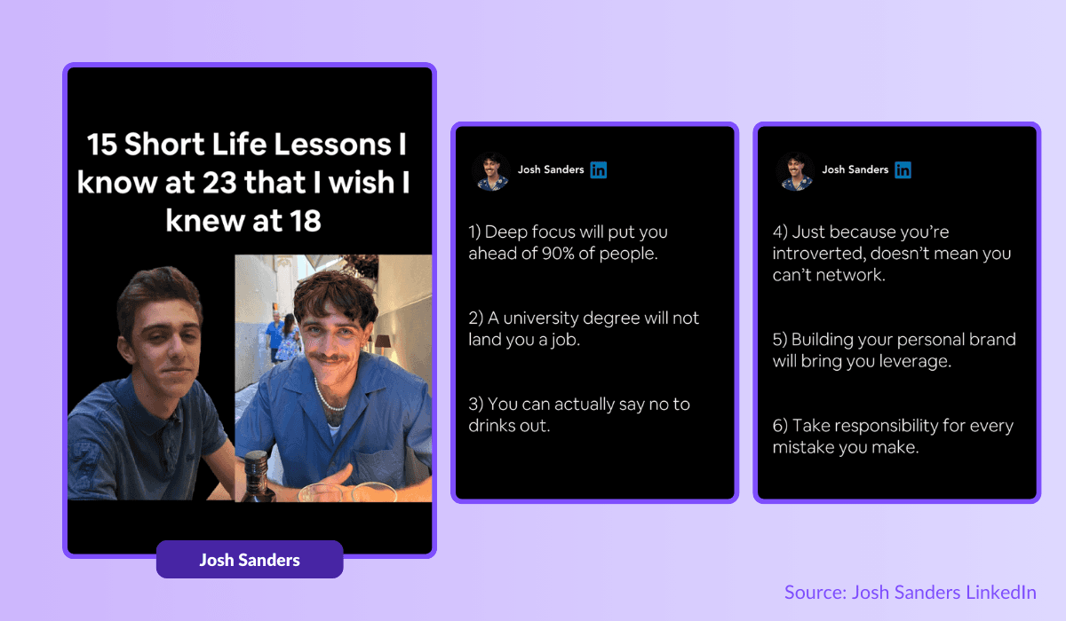
Chat with Your Audience
Engage your audience on LinkedIn with a friendly, conversational tone that feels like a warm, inviting chat.
Ditch the corporate jargon and speak directly to them, making your content relatable and compelling, sparking genuine connections and conversations that keep them coming back for more!
Stay professional of course but do not forget that you sell your product and yourself through your LinkedIn carousel.
Create Visual Harmony
Crafting visual harmony in your LinkedIn carousel is key to making a dazzling impression!
By weaving together colors, fonts, and design elements seamlessly, you'll not only catch eyes but also keep your audience hooked, boosting engagement and reinforcing your brand's identity.
End with a Bang
Finish with a powerful call-to-action (CTA) that prompts action.
You always wanted to know how to write a good CTA like your favorite creator? Here are some steps to follow in order to finish on a high note… and get some clicks of course!
Stay In Action : Pretty obvious right? However, many creators forget to use an action verb. By using it, you are using a cognitive bias that will encourage your reader to click on your offer, link, etc. This is no laughing matter, use the action.
Add Urgency : “Click and get your free template” / “Click now and get your free template”. Yes, you want to click on the second one. And it’s normal. Adding urgency to your CTA is essential. Our brains, and therefore those of your audience, like to be entertained and when they're under pressure, they react with action. In this case, it's clicking on your link.
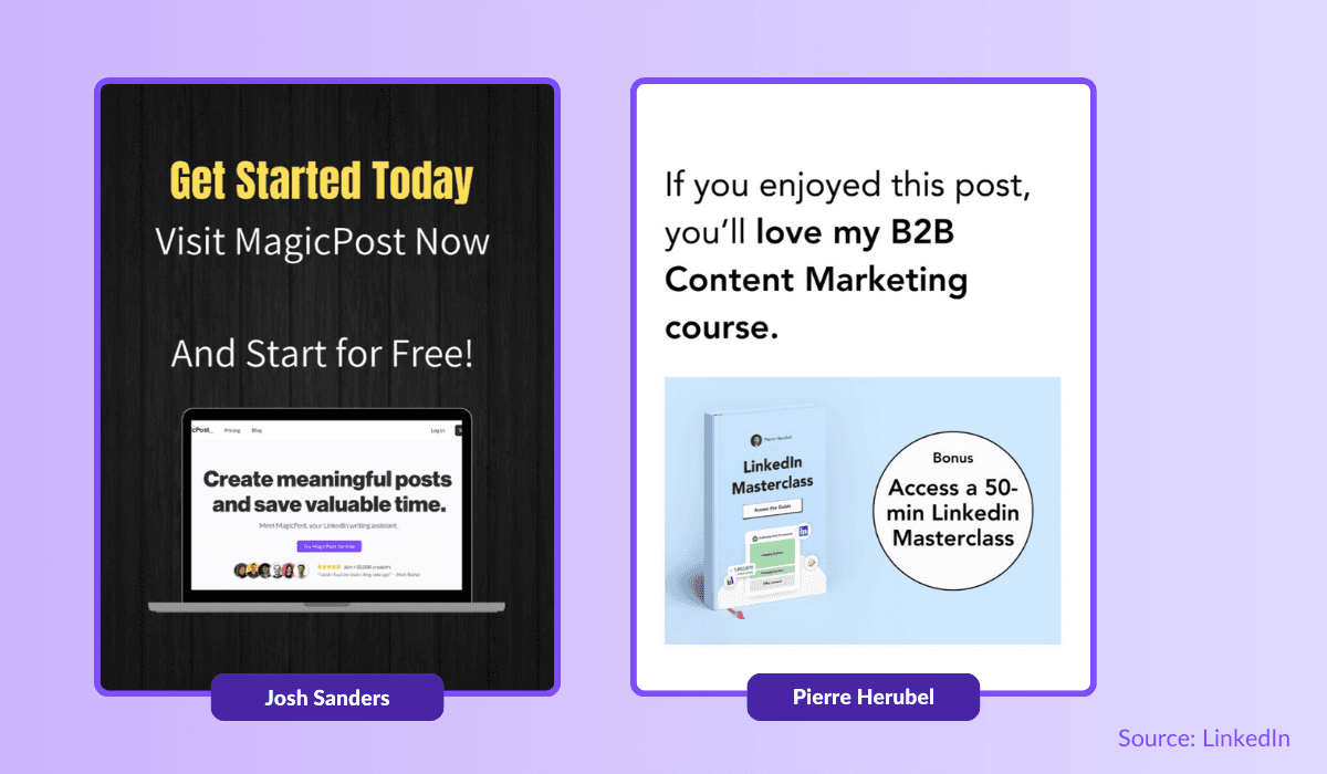
Be Concise : For your CTA to remain effective, it must be short, fluid and simple. Just look at the links you click on. You like to be guided unconsciously. And so does your audience. Remember, when you write well, you keep it short.
Be Irresistible : Your CTA must be appealing. You have to make people want to follow you, especially if it could lead to a sale or a profit. Remind them of the initial promise. Make an offer your reader can't refuse!
Be Direct : Another tiny exercice. Which one do you choose between “If you wish, you can click here to obtain your MagicPost offer” or “Click here now and get your MagicPost offer.”. Yep, the second one. Your audience has no time to lose. Be direct. Be effective.
How to post a LinkedIn carousel
Now you’ve got everything you need to crush it on LinkedIn with your killer carousels, right? Before you hit it big, just have in mind that LinkedIn recent changes mean you can now only share carousels as documents, so make sure your design is saved as a PDF.
To-Do List to Get Your Carousel Live
Start a New Post
Head over to your feed or homepage and click Start a post. If you don’t see the document button right away, click the Plus sign (+) or "more" to find it.
Select Add a document and upload your carousel PDF file. Alternatively, you can just drag and drop the file directly into the post box.
Add a Title
Give your carousel a catchy title. This will appear above the carousel in your feed and helps your content get noticed. Keep it under 150 characters to avoid it getting cut off.
Include a Caption
Add a short description of your carousel, giving viewers a sneak peek of what’s inside. Don’t forget to use @ to mention people and # to add relevant hashtags for better reach.
Publish Your Post
Once everything’s set, hit the Post button and share your carousel with your LinkedIn network!
Carousels Are Now Your Secret Weapon On LinkedIn!
Integrating carousels into your LinkedIn content strategy can significantly boost your engagement and reach. The best part? It’s easier than you think!
From crafting your carousel to sharing it with your network, this guide is packed with tips. Start creating carousel posts like a pro and watch your influence grow!
How to post GIFs on LinkedIn
Boost LinkedIn engagement with GIFs. Learn how to find, create, and use GIFs to enhance your posts and connect with your audience.
How to Create LinkedIn Carousel Posts (2026)
Learn the best practices on how to create LinkedIn carousel posts. To level up your presence, follow our to‑do list for crafting carousels on LinkedIn.
Top 5 Types of Posts for LinkedIn Success
Gain visibility on LinkedIn with these 5 post types: Client Success Stories, Industry Stats, Personal Stories, Thought Leader Quotes, Resource Lists.
How to Post a PDF on LinkedIn
Discover the top best practices to post your PDF on LinkedIn. In order to level up your presence, use our to-do list for your LinkedIn PDF.
Top 5 Kleo Alternatives in 2026
Find the best alternatives to Kleo to boost your LinkedIn profile. Try tools like MagicPost, PerfectPost to grow your audience and create better content.


