" height="26.80529977783203px" id="tymKb8bqC" width="128.00300311279295px"/><path d="M 0 2.417 L 0 0 L 12.909 0 L 12.909 2.417 Z" fill="rgb(126, 78, 253)" height="2.417099999999998px" id="aYr4em6zK" transform="translate(128.341 22.325)" width="12.908999999999992px"/></svg>)
"/><stop offset="1" stop-color="rgb(118, 37, 250)"/></linearGradient></defs><g d="M 19.242 21.22 L 19.362 6.204 L 19.272 6.204 L 13.757 21.22 L 10.161 21.22 L 4.796 6.204 L 4.706 6.204 L 4.825 21.22 L 0 21.22 L 0 0 L 7.283 0 L 12.109 13.607 L 12.229 13.607 L 16.844 0 L 24.247 0 L 24.247 21.22 Z M 26.421 26.113 L 26.421 23.445 L 41.407 23.445 L 41.407 26.113 Z" fill="transparent" height="26.112508199679183px" id="DvfaAIHYn" width="41.40731898311435px"><path d="M 19.242 21.22 L 19.362 6.204 L 19.272 6.204 L 13.757 21.22 L 10.161 21.22 L 4.796 6.204 L 4.706 6.204 L 4.825 21.22 L 0 21.22 L 0 0 L 7.283 0 L 12.109 13.607 L 12.229 13.607 L 16.844 0 L 24.247 0 L 24.247 21.22 Z" fill="rgb(46, 46, 46)" height="21.220180016149442px" id="pLsxRCobd" width="24.247352589074694px"/><path d="M 0 2.668 L 0 0 L 14.986 0 L 14.986 2.668 Z" fill="url(%23yD9d4I5GR-3279285344-linear-gradient)" height="2.6675085048549647px" id="yD9d4I5GR" transform="translate(26.421 23.445)" width="14.986002836263765px"/></g></svg>)

Bénédicte Rivory
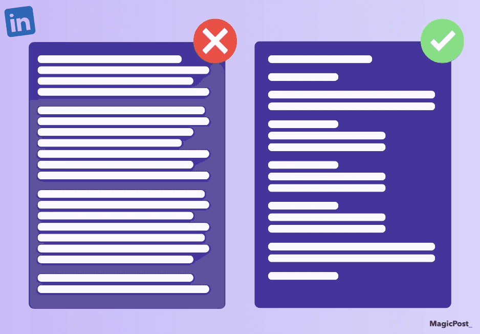
A strong idea buried in a wall of plain text is still a strong idea, but most people won't find it. LinkedIn readers scan fast, especially on mobile, and a post without visual structure gives them no entry point.
Bold text creates those entry points. Used well, it anchors the eye to the key phrase, makes your hook land harder, and gives the reader a path through the post.
Here’s how to bold text in LinkedIn posts. For the full picture on how formatting affects LinkedIn impressions, that's worth a read.
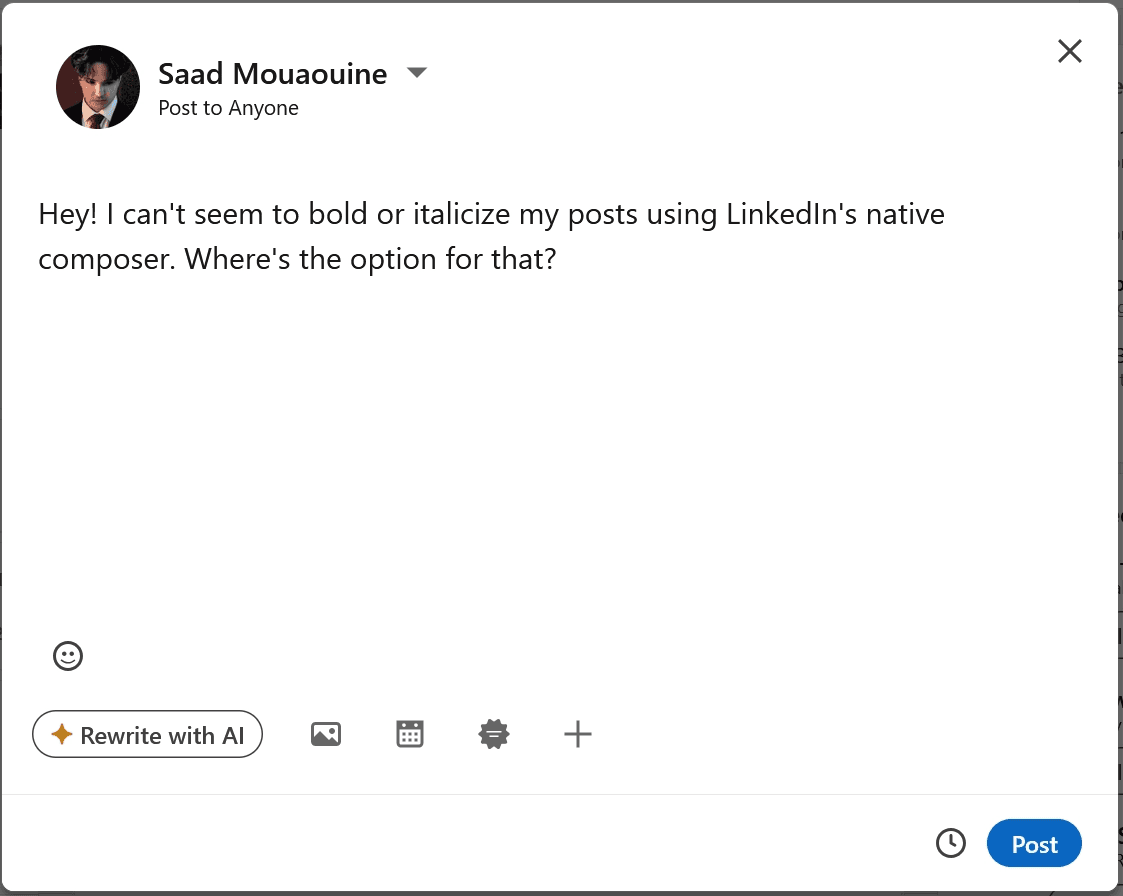
Short Answer: LinkedIn doesn't support native bold text in posts. To add bold, use a LinkedIn text formatter tool; it converts your text into Unicode bold characters that render correctly in the feed.
Paste your text into the tool, select what you want to bold, copy the output, and paste it into LinkedIn. Use bold sparingly: a maximum of one or two anchors per post.
Can You Bold Text on LinkedIn?
LinkedIn doesn’t have a built-in option that allows you to bold text in your posts, comments, or profile.
However, you can use bold text on LinkedIn using a formatting tool that converts regular text into bold characters.


क्या आप लिंक्डइन पोस्ट में टेक्स्ट को बोल्ड कर सकते हैं?
आप लिंक्डइन की पोस्ट में मूल रूप से टेक्स्ट को बोल्ड नहीं कर सकते। लिंक्डइन का पोस्ट कंपोज़र बोल्ड, इटैलिक, या किसी भी टेक्स्ट स्टाइलिंग विकल्पों को शामिल नहीं करता है।
केवल लिंक्डइन लेख और न्यूज़लेटर्स में एक फॉर्मेटिंग टूलबार है; नियमित पोस्ट और टिप्पणियाँ डिफ़ॉल्ट रूप से साधारण टेक्स्ट होती हैं।
काम करने का तरीका यूनीकोड कैरेक्टर्स हैं। लिंक्डइन पोस्ट में बोल्ड टेक्स्ट वास्तव में बोल्ड नहीं होता है; यह यूनीकोड कैरेक्टर्स का एक सेट है जो दृश्य रूप से बोल्ड अक्षरों के समान होते हैं और लिंक्डइन के डेस्कटॉप और मोबाइल ऐप्स में सही ढंग से प्रदर्शित होते हैं।
एक टेक्स्ट फॉर्मेटर टूल स्वचालित रूप से रूपांतरण को संभालता है।
How to Bold Text in a LinkedIn Post
The fastest way to bold text in a LinkedIn post is using MagicPost’s free LinkedIn text formatter:
Paste or write your post text in the formatter.
Select the words or phrases you want to bold.
Select one of the style settings to convert the selection into Unicode characters.
Copy the full formatted text.
Paste it directly into your LinkedIn post composer.
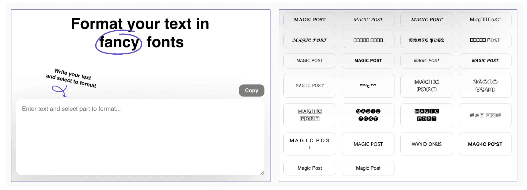
The formatted text will look bold in LinkedIn’s feed on desktop and mobile without any further steps. No account is required to use the free tool.
💡 Pro Tip: If you use MagicPost to write and schedule your posts, the built-in formatter is already part of the editor. You can bold, add bullet points, and structure your post without switching tools.
LinkedIn Text Formatting: What Else Works
Bold is the most impactful formatting option, but it's part of a broader toolkit. Here's what's available and when each one helps.
Italics
Like bold, italic text in LinkedIn posts uses Unicode characters via a text formatter.
Italics are a lighter touch; they’re useful for quotes, book or article titles, or a single phrase you want to carry extra weight without the visual loudness of bold.
→ Use italics when you want emphasis without interruption.
Emojis
Emojis work effectively as structural markers rather than decoration.
An emoji at the start of a bullet point or section gives the eye a landmark while scanning. Used consistently, they also become part of your visual identity; readers recognize your posts before they've read a word.

Two caveats you need to keep in mind:
LinkedIn is still a professional platform. Emojis that work on Instagram or X can read as off-brand for certain industries or audiences. Test what fits your voice before committing to a style.
Emojis are a hallmark of AI LinkedIn posts. If you’re not careful, readers might associate your posts with low-effort AI posts and scroll past them.
Capital Letters
All-caps is the bluntest formatting tool available and the easiest to misread as shouting. One legitimate use is acronyms and abbreviations (AI, CRM, SaaS), where capitalization is the standard. For emphasis, bold is almost always the better choice.
Line Breaks and Spacing
This isn't a formatting tool in the traditional sense, but it's the most impactful formatting decision you make.
One idea per paragraph, two to three lines maximum, with a blank line between each paragraph. White space isn't wasted space; it's what makes each idea stand out separately rather than blending into the next.
For a full breakdown of LinkedIn post formatting, including before-and-after examples, this guide on LinkedIn text formatting covers everything in one place.
4 Bold Text Mistakes That Make Posts Harder to Read
Absolutely avoid these mistakes if you don’t want LinkedIn users to scroll past your posts.
1. Bolding Full Sentences or Entire Paragraphs
When everything is bold, nothing is bold. Visual hierarchy disappears and the post becomes tiring to read on mobile.
→ Bold is effective precisely because it contrasts with the surrounding plain text; remove the contrast and you remove the function.
⚠️ Rule of Thumb: Bold should cover no more than 10 to 15 percent of your post text. One or two anchors per post is usually enough.
2. Using Bold as a Substitute for Clear Writing
Bold won't fix a disorganized post. If the idea is unclear, bolding random words adds visual noise without adding meaning.
→ Start with clean structure (short paragraphs, intentional line breaks, and one clear idea per section), then use bold to highlight what matters most within that structure.
3. Bolding the Wrong Words
Bold should highlight meaning, not filler. Words like "important," "amazing," or "key" don't earn bold because they're generic.
→ Bold the concrete part: the result, the number, the specific claim, or the action that carries the weight of your point.
4. Stacking Multiple Formatting Styles
Bold plus italic plus emojis plus CAPS in the same block reads like a promotional email, not a LinkedIn post.
Pick one or two emphasis techniques and use them consistently. A post with disciplined formatting looks confident, but a post with everything turned up to maximum looks desperate for attention.
Format Every LinkedIn Post Before You Publish
Formatting is one of those things that takes two minutes and makes a visible difference. MagicPost's free LinkedIn text formatter handles bold, italic, and spacing in one place, and you don’t need an account to use it.
If you want to write, format, preview, and schedule your posts without switching between tools, MagicPost's full editor does all of that. Try it for free today; no credit card required to start.
Frequently Asked Questions
Can I bold text in LinkedIn posts?
Yes, but not natively. LinkedIn's post composer doesn't support text formatting. To bold text, use a LinkedIn text formatter tool that converts your text to Unicode bold characters. These render correctly in LinkedIn's feed on all devices.
Does bold text help LinkedIn post performance?
Indirectly, yes. Bold improves readability by giving readers visual anchors, which increases dwell time, a key signal in LinkedIn's algorithm.
Posts that are easy to scan tend to generate more engagement than dense walls of plain text. That said, excessive bold has the opposite effect and makes posts harder to read.
Can I bold text in LinkedIn comments?
Yes. The same Unicode-based formatting works in comments. Use a text formatter, copy the bold text, and paste it into your comment. It renders the same way as in posts.
Will LinkedIn penalize my post for using bold text?
No. LinkedIn doesn't penalize posts for Unicode formatting. The only risk is self-inflicted: over-bolding makes posts harder to read, which reduces dwell time and engagement. Used sparingly and intentionally, bold text is a net positive for readability and post performance.
Should I use multiple formatting styles in one post?
Use one or two at most. Bold for key anchors, italics occasionally for quotes or titles, emojis as structural markers if they fit your voice. Stacking bold, italics, caps, and emojis in the same block makes the post look cluttered and reads as low-quality on professional feeds.

LinkedIn Post Formatting Guidelines 2026
LinkedIn post formatting for B2B with this 2026 guide. Types of posts, structural rules, and best practices.

LinkedIn Post Size: Complete Formats and Dimensions Guide
Explore the perfect LinkedIn post size for your updates, videos, carousels, and documents to improve your content strategy and boost engagement.
LinkedIn Post Size: Complete Formats and Dimensions Guide
Explore the perfect LinkedIn post size for your updates, videos, carousels, and documents to improve your content strategy and boost engagement.

LinkedIn Text Formatter: How to Format Posts That Get Noticed
LinkedIn does not support native text formatting. Use a LinkedIn text formatter to add bold, italics, and structure that makes posts impossible to scroll past.