" height="26.80529977783203px" id="tymKb8bqC" width="128.00300311279295px"/><path d="M 0 2.417 L 0 0 L 12.909 0 L 12.909 2.417 Z" fill="rgb(126, 78, 253)" height="2.417099999999998px" id="aYr4em6zK" transform="translate(128.341 22.325)" width="12.908999999999992px"/></svg>)
"/><stop offset="1" stop-color="rgb(118, 37, 250)"/></linearGradient></defs><g d="M 19.242 21.22 L 19.362 6.204 L 19.272 6.204 L 13.757 21.22 L 10.161 21.22 L 4.796 6.204 L 4.706 6.204 L 4.825 21.22 L 0 21.22 L 0 0 L 7.283 0 L 12.109 13.607 L 12.229 13.607 L 16.844 0 L 24.247 0 L 24.247 21.22 Z M 26.421 26.113 L 26.421 23.445 L 41.407 23.445 L 41.407 26.113 Z" fill="transparent" height="26.112508199679183px" id="DvfaAIHYn" width="41.40731898311435px"><path d="M 19.242 21.22 L 19.362 6.204 L 19.272 6.204 L 13.757 21.22 L 10.161 21.22 L 4.796 6.204 L 4.706 6.204 L 4.825 21.22 L 0 21.22 L 0 0 L 7.283 0 L 12.109 13.607 L 12.229 13.607 L 16.844 0 L 24.247 0 L 24.247 21.22 Z" fill="rgb(46, 46, 46)" height="21.220180016149442px" id="pLsxRCobd" width="24.247352589074694px"/><path d="M 0 2.668 L 0 0 L 14.986 0 L 14.986 2.668 Z" fill="url(%23yD9d4I5GR-3279285344-linear-gradient)" height="2.6675085048549647px" id="yD9d4I5GR" transform="translate(26.421 23.445)" width="14.986002836263765px"/></g></svg>)

Yasmina Akni Ebourki
Your content could be genuinely great. The insight is there, the hook is decent, but if it arrives as one unbroken wall of text, most people won’t give it a second glance.
LinkedIn readers scroll fast. They make a split-second decision about whether to keep reading or move on, and that decision is made before they’ve absorbed a single idea. Formatting is what tips that decision in your favor.
This guide covers everything you need to know about formatting LinkedIn posts: what works, what doesn’t, and the fastest way to do it properly.
Short Answer: LinkedIn doesn't support native text formatting. Bold, italics, and structure all require Unicode characters generated by an external LinkedIn text formatter.
Good formatting improves readability, signals effort, and keeps readers from scrolling past. The highest-impact changes are short paragraphs with line breaks, selective bold for emphasis, and a strong first line. Avoid over-bolding, emoji overload, and inconsistent spacing. Always preview on mobile before publishing.
Use a LinkedIn Text Formatter in Seconds
LinkedIn doesn’t have native bold, italic, or font styling in posts. To get formatted text that actually shows up in the feed, you need an LinkedIn text formatter.
MagicPost’s free LinkedIn text formatter lets you write or paste your post, select the text you want to style, and copy the formatted version straight into LinkedIn.
No account needed. Paste your text, pick your style, and copy it out. That’s it.
If you want to go further than text styling (adding AI-generated hooks, scheduling, and a full content workflow), MagicPost handles all of that in one place.


Why Formatting Matters on LinkedIn
LinkedIn isn’t a blog. people aren’t sitting in to read. They’re scrolling between meetings, on their phone, half-distracted. Your post has roughly two seconds to earn their attention before they keep moving.
Good formatting does three things at once:
It signals effort. A well-structured post tells readers you cared enough to make it readable. That impression transfers to your content.
It creates visual breathing room. White space between paragraphs makes a post feel manageable rather than exhausting.
It guides the eye. Bold text, line breaks, and short paragraphs give readers a path through your content rather than leaving them to find their own way.
The result is higher dwell time, more saves, and better reach. LinkedIn’s algorithm rewards content that keeps people reading, and formatting is one of the cheapest ways to make that happen.
What Good Formatting Actually Looks Like
Before getting into the individual techniques, here’s the clearest way to understand the difference formatting makes. Same content, two presentations:
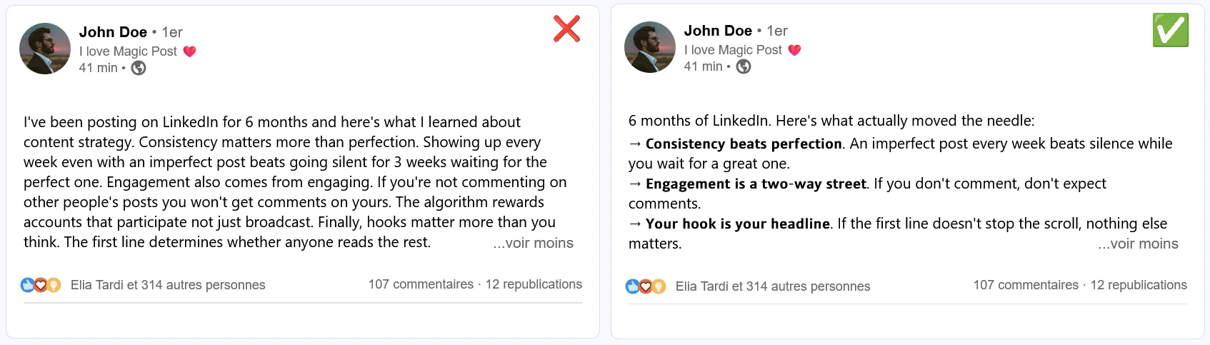
These ideas are the same. The formatted version is easier to scan, easier to finish, and more likely to generate a save or a comment. The unformatted version isn’t bad writing; it’s just invisible.
LinkedIn Formatting Techniques That Work
Greater dwell time is the result of deliberate formatting. Here are the techniques that actually work.
1. Line Breaks and Paragraph Length
This is the single highest-impact formatting change you can make. LinkedIn compresses text. A paragraph that looks fine in a Word document becomes a dense block in the feed.
The rule is simple: one idea per paragraph, two to three lines maximum. When you move to a new point, hit enter twice. That empty line between paragraphs isn't wasted space; it's what makes each idea land separately rather than blurring into the next one.
💡 Pro Tip: Write your post normally first, then go back and break it up. It's much easier to add line breaks after the fact than to think about structure while you're still working out what you want to say.
2. Bold Text
LinkedIn doesn't support native bold in posts. What you see as bold text in the feed is actually Unicode characters that look bold, which is why you need a text formatter tool to create it.
Bold is most useful for three things:
Section headers in longer posts, so readers can jump to what's relevant to them
Key terms or phrases you want to stick in someone's memory
The first two or three words of a bullet point, to anchor each item
⚠️ Warning: Don't bold more than 10 to 15 percent of your text. When everything is emphasized, nothing is. A post with five bolded phrases has hierarchy. A post where every other line is bolded just looks like noise.
3. Italics
Like bold, italics in LinkedIn posts use Unicode characters rather than native formatting. A text formatter handles the conversion automatically.
Italics work best for:
Quotes or things someone said, to visually separate them from your commentary
Book or article titles you're referencing
A single phrase you want to carry extra weight without the visual loudness of bold
Italics are a lighter touch than bold. Use them when you want emphasis without interruption; the reader notices it without breaking stride.
4. Emojis as Structure Tools
The most underrated use of emojis on LinkedIn isn't decoration. It’s actually navigation. An emoji at the start of a bullet point or section header gives the eye a landmark to latch onto while scanning.
Used consistently, they also become part of your visual identity. If you always use a specific emoji as your bullet style, regular readers start to recognize your posts before they've read a word.
💡 Pro Tip: Pick one or two emojis you use consistently as structural markers and stick to them. A purple circle as your bullet point, a lightning bolt before a key insight. Consistency makes it a brand signal rather than decoration.
⚠️ Warning: LinkedIn is still a professional platform. Emojis that work on Instagram or Twitter can read as off-brand in certain industries or for certain audiences. Test what fits your voice before committing to a style.
5. The First Line Is Everything
LinkedIn cuts your post off after two or three lines with a "see more" prompt. Everything before that cutoff is your hook, and it's the only part most people will read.
If it doesn't earn the click, the rest of your formatting is irrelevant. See what makes a strong LinkedIn hook work and why the first line carries almost all the weight.
A few things that kill hooks:
Starting with context before the point; readers want the payoff first, the setup second
Vague openers like "I've been thinking about..." or "Something interesting happened..."
A first line that looks like every other post in the feed
Your formatting makes the post readable. Your hook makes it worth reading. You need both.
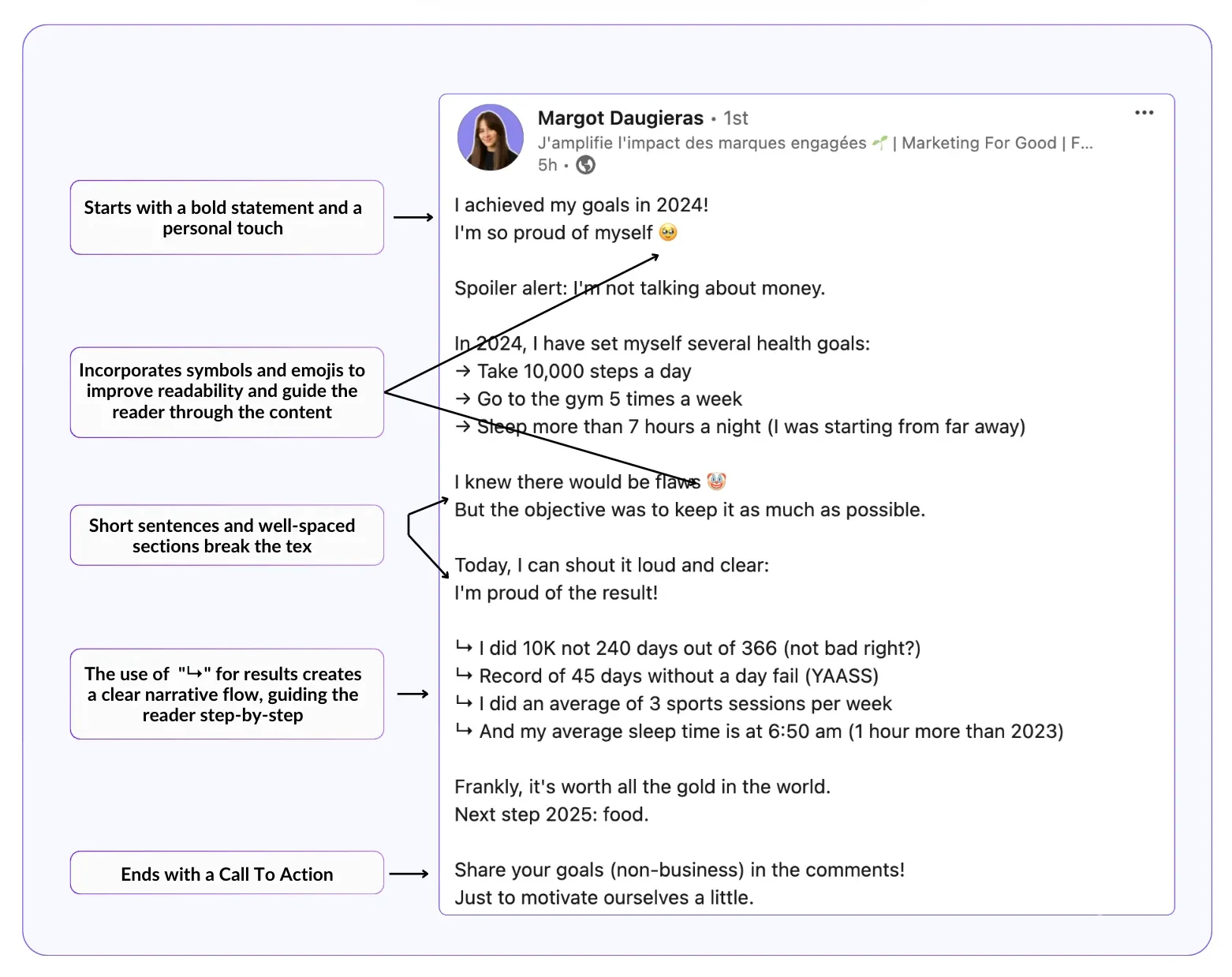
6. Post-Level Structure
For longer posts, the structure matters as much as the individual formatting choices. A post that opens with a hook, builds through short punchy paragraphs, and closes with a clear call to action will outperform a post that has the same information in a different order.
A simple structure that works consistently:
Hook: One or two lines that earn the "see more" click
Body: Short paragraphs or a list, each point on its own line
Close: A single-sentence takeaway or question that invites a comment
For a more detailed breakdown of post structure and length, avoid these worst LinkedIn posts and check out this guide on how long a LinkedIn post should be. It’ll help you finalize your approach.
LinkedIn Formatting Mistakes That Hurt More Than Help
Formatting done wrong is worse than no formatting. Here’s what to avoid:
Over-bolding. If half of your post is bold, none of it stands out. Bold loses its function when it’s everywhere.
Emoji overload. A post with fifteen different emojis looks cluttered and hard to read. Pick a few and use them with intention.
Inconsistent line breaks. Some paragraphs have breathing room, others don’t. It creates a jarring rhythm that slows readers down.
Formatting without substance. A beautifully formatted post with nothing to say is still a post with nothing to say. Formatting amplifies good content, but it can’t rescue weak content.
All caps for emphasis. WRITING IN CAPS reads as shouting. Use bold instead.
Don’t Miss Mobile Rendering
More than half of LinkedIn traffic comes from mobile. A post that looks clean on desktop can wrap differently on a phone, cutting off a line mid-sentence or creating unintended paragraph breaks.
Before publishing anything important, preview how it looks on a smaller screen. MagicPost's free LinkedIn post previewer shows you both desktop and mobile views before you hit publish, which is the fastest way to catch formatting issues before they become public.
💡 Pro Tip: Keep your most critical lines (your hook and your close) short enough to display fully on mobile without wrapping mid-sentence. If a line wraps at an awkward point, it disrupts the rhythm your formatting was supposed to create.
FAQ
Does LinkedIn support native bold or italic text?
No. LinkedIn doesn't have built-in text styling for posts. Bold, italic, and other formatting options you see in the feed use Unicode characters that visually resemble styled text. You need an external formatter to create them.
Will formatted text display correctly on all devices?
Yes, Unicode characters render consistently across desktop, mobile, and the LinkedIn app. The formatting style won't break between devices. What can vary is how line breaks and paragraph lengths display on different screen sizes, which is why previewing on mobile before publishing is worth doing.
Can I use formatted text in LinkedIn comments and messages?
Yes. The same Unicode-based formatting works in comments and direct messages. Format your text using a tool, then paste it wherever you want it to appear.
How much formatting is too much?
If you have to ask, you're probably close to the line. A good rule of thumb: bold should cover no more than 10 to 15 percent of your text, emojis should serve a structural purpose rather than decoration, and every formatting choice should make the post easier to read, not just more visually busy.
Does formatting actually improve engagement?
Formatting improves readability, and readability improves the chance that someone finishes your post. A post that gets read fully is far more likely to generate a comment or save than one people abandon halfway through.
That said, formatting doesn't replace strong content. It amplifies it. If you want to understand what drives engagement beyond formatting, this guide on how to increase impressions on LinkedIn covers the wider picture.
Is a LinkedIn text formatter safe to use?
Yes. A text formatter like MagicPost's free tool doesn't connect to your LinkedIn account at all. It converts your text to Unicode characters locally, and you paste the output into LinkedIn yourself. There's no login, no API access, and no account risk.

11 Best Magnettu Alternatives for LinkedIn Agencies (2026)
Magnettu sells per-profile tiers from €29.95 to €300/mo. 11 agency-grade LinkedIn alternatives compared with receipts on workflow, pricing and record.

11 Best Buffer Alternatives for LinkedIn Growth (2026)
Buffer is a great scheduler, but it stops at publishing. 11 alternatives that do AI writing, planning and LinkedIn depth better, compared with receipts.

11 Agorapulse Alternatives for LinkedIn Mentions (2026)
Agorapulse's own docs say personal profiles can't mention each other on LinkedIn. 11 specialist alternatives with receipts: mentions, voice AI, benchmarks.

Best Contea Alternatives for LinkedIn Ghostwriters (2026)
The best Contea alternatives for LinkedIn ghostwriters and agencies, compared with equal depth: best-for, key features, pros and cons, and monthly pricing.

Taplio Review: Powerful, But Are You Overpaying? (2026 Update)
Taplio combines AI post writing, scheduling, and LinkedIn outreach in one platform. But is it worth it for your use case? This Taplio review has the answer.

How Agencies Manage LinkedIn Engagement for Clients
Engage with each client's prospects, partners and peers from a daily curated feed, comment in one click via the official LinkedIn API, and report the work.

White-Label LinkedIn Reports for Agency Clients
Send client reports under your own brand, not the tool's. What to include in a white-label LinkedIn report and how to build one in minutes, not an afternoon.